
Role
Founding Product Designer
Company
Incredible - a developer video content creation app
Year
2021-2022
Challenges in video content creation for developer.
Based on our initial research, we identified the challenges in video content creation for developers.
Complex and technical. Developers are required to learn video editing tools that aren't specifically designed for their needs.
Aesthetic finesse. A good understanding of aesthetics is a crucial contributor to producing visually pleasing videos.
A value proposition users can’t refuse.
Although Incredible was a massive and ambitious dream, the value proposition needed to be ridiculously simple—a proposition users couldn't refuse.
So we came up with a value proposition that’s a no-brainer.
‘The easiest way to create developer video content’
The Minimum Viable Product.
Building the atomic unit.
I designed the MVP where the user can input their content, and we'll generate a video frame accordingly. The user can select a layout style, record a video explaining the content, and then download it.
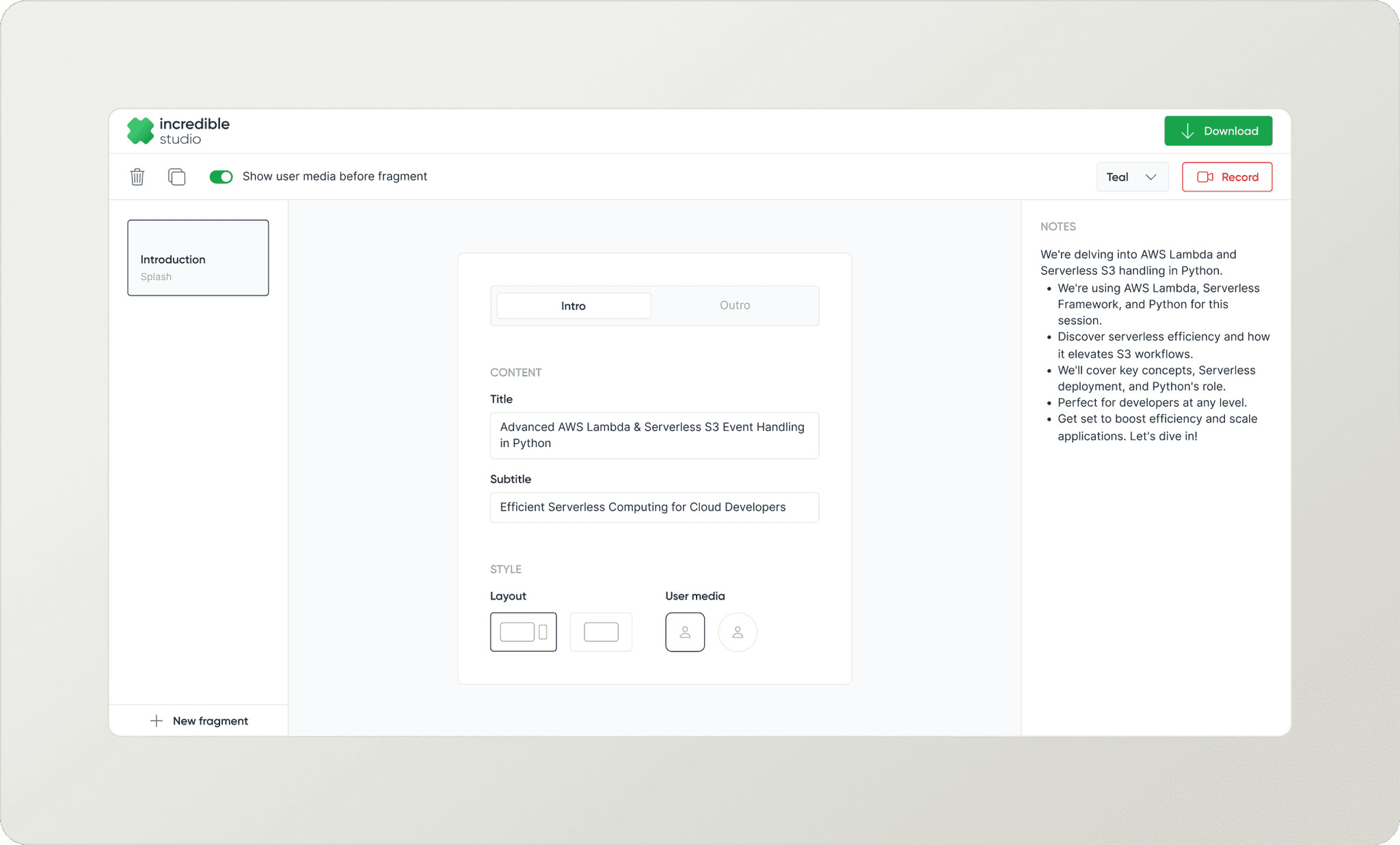
Introduction fragment screen

List of Fragments, VideoJam and CodeJam screens

Recording screen
Testing the MVP.
I conducted evaluation research with 5 individuals to assess the validity of our product. I recruited 5 devs, 3 of them who regularly created developer educational content and 2 developer advocates.
I decided to start by watching them explore Incredible first; then nudging them to create things. Here are some questions I asked.

Questions
Users were impressed by how quickly they were able to create a video.
80% of the tasks were completed successfully and most of them were impressed by how quickly they were able to create a video that had animations, with zero video editing.
It also reiterated our initial findings that developers were struggling to create videos that looks good as they were not comfortable with traditional video editing tools as it is time-consuming, expensive and hard.

Test results
‘What do you think?’
Finally I asked them for their feedback. All of them thought addition of more customisation and templates would make it better.

Users’ feedback on the MVP
Findings and uncovered insights.
Based on the usability test and follow-up interviews, these were the major insights.
Easy and Quick. Users loved that they were able to quickly create a video.
Need customisation. Users expressed a need for more customisation options to give the videos a personal touch.
THE CHALLENGE
A fully customisable canvas.
Canva - but for developer videos.
We called this version Designer, where users can freely add texts, objects and images anywhere in the canvas. We also introduced templates.

A fully customisable canvas
Testing the protoype.
As developing a full-fledged editor would take a significant amount of time, I decided it's best to test it during its design phase.
So, I created a Figma prototype with almost all possible interactions (which was like a billion interactions). Though it wasn't possible to mimic all the canvas features, the interactions were sufficient to test our hypothesis.
The goal of this observation test was to observe and record the user's natural reactions and responses to the product. Therefore, I did not create a set of small tasks; instead, I assigned just one single task:

Observational test task
Most of the users didn’t use the design features.

Metrics I used to score the test
How much customisation is too much customisation?
While video creation already requires a lot of effort, complete flexibility in designing the video frames could be exhausting.
We started out to make the process simpler but addition of a lot of flexibility made it harder. I realised we didn’t want the users to make difficult design choices.
THE CHALLENGE
Find a balance between too little and too much customization
Can we turn the existing workflow for video creation to a simpler and efficient version?
I missed something..
While I was focused on adding customisation, missed something crucial from the MVP’s feedback.
'Users’ Existing Workflow'
Going back to the old feedback was a light bulb moment. I realised we needed to understand more about the current workflow to try and fix it.

Feedback from MVP phase
Understanding the existing workflow.
I conducted interviews with users to understand their current video creation workflow.
Most developers had unique workflows with multiple steps and they kept iterating trying improve their workflow for better output. There was no one-answer.
But these were the 3 common steps most of them had:

Exiting workflow
KEY DISCOVERY
Over 90% of the users used an external tool (google docs, word, notion, etc) for storyboarding before starting to create the video.
Finding the missing puzzle piece.
Now everything was falling into place like pieces of a puzzle - I realized that Storyboarding is essential for streamlining the workflow and making it more efficient.
The notebook experience.
Storyboarding and Live preview.
I designed a notebook experience where you input your content for storyboarding and get a live preview of the video frame alongside. It seamlessly connected pre-production to production, ensuring a smooth workflow.
You can add frames (code, video, image, text, and points) to each fragment, with the option to include a title and subtitle for each frame.
Adding code to the notebook
No more hard design decisions.
We also removed the canva-like design experience and brought in composition, where users can pick from pre-designed components - layouts, transitions, lower thirds, etc.
This enables the user to create aesthetically good videos without having to make hard design decisions.

Pre-designed components - layouts, transitions, lower thirds
Two levels of timelines was confusing.
I conducted an observational test with 5 users to understand how users are interacting with the new flow.
The test showed that having fragments in a timeline on the left, and frames in another timeline inside each fragment was confusing for most users.
Also, it was evident that the term fragment was new to the users and often they didn’t understand what it meant.

Two timelines
The storyboarding feature was not efficient enough.
Since, frames had a type, users needed to make the decision of what to pick before they start storyboarding. So, users still continued to use external tools for storyboarding and then picked appropriate type of frame inside a fragment and copy-pasted the content here.
I realised the storyboarding feature was not as flexible as we wanted it to be.

Popover to add a frame
One notebook + markdown
No fragments, just one notebook.
We removed the concept of fragments and frames and decided to have a common timeline for the whole video and each frame inside the timeline is now called “blocks”.
Developers often use markdown to write blogs and storyboard. Now, users can simply type or paste their markdown like they usually do. There's no need to select frame types; just add content in any order, and we'll do the heavy lifting of detecting the blocks.
Each type of content is recognised as a block with a title and subtitle, if provided. Additionally, paragraphs beneath a content are identified as notes of that block.

New notebook with one timeline
It was time for a new look.
For this improvement, I had to move things around. And as we we figured out the core experience of Incredible, I saw places where we can improve the visual design and create a strong visual language for Incredible.
The new look was a hybrid theme with dark headers and timeline, alongside a light canvas and properties panel.

Hybrid theme
Two views - Notebook and Preview.
Instead of the preview being a modal, now it has a separate view dedicated to it.
User can navigate to preview from the sub-header or by clicking on the in-line preview on the notebook.

Ways to navigate to Preview
A contextual properties panel.
The properties panel was contextual, showing the relevant editing options based on the currently active block type.

Code block properties
A complete dark recording page.
The dark recording page is easier on the eyes and helps the user focus better on what they're recording.

New recording page
Sprinkling some magic ✨
Adding a little personality.
I wasn't a fan of the user media placeholder we had. It was just a rectangle with a user icon. The placeholder was used a lot throughout the app. Therefore, I wanted to add some life and fun to it.
So, I created some abstract avatars to use for the user media placeholders in the preview.

Old user media placeholder

New user media placeholder
Subtle animations for better experience.
In Preview, we didn’t have the ability to show how animations will look while recording. So, I added some subtle animations to better illustrate certain properties.
For example, the appearance animation of points has three options: stack, replace, and together. On selecting an option, an animation appears below to demonstrate how it looks.
Appearance animation for points
Smart animation.
We also implemented smart animate transitions, which recognizes elements within each frame. So, when the same element appears in subsequent frames, it moves and resizes seamlessly to fit its position.
Smart animate transition
Canvas controls while recording.
When talking over something, you may want to zoom in to highlight specific details. The zoom-in feature allows you to focus on a specific part while recording.
Zoom-in canvas control
Received a lot of love from devs around the world!

Tweets from Developers about Incredible’s demo
Helped to create videos for DevsforUkraine conference
We created a custom template for DevsforUkraine to create videos for the conference.
It was an engineering conference with the goal to raise funds and provide support for Ukraine in 2022.

Screenshots from video created for DevsforUkraine

Tweets from DevsForUkraine and Cassidy Williams
Takeaways:
Learning and unlearning. The journey for Incredible, from its MVP to alpha, was far from linear. It involved a significant amount of learning and unlearning.
Listening to users. I learned the significance of actively listening to users instead of solely relying on assumptions.
Prioritizing refinement. Rather than focusing on building numerous features, prioritizing the refinement of existing ones proved more beneficial.
Wore a lot of hats. I conducted user tests, research, collaborated closely with founders, and led the development of Incredible's core experience, learning to be autonomous.